With the recent announcement of iOS 16’s new Medication features, a world of possibility is opening up that could enable simpler and more streamlined experiences in an area that has been historically underserved and technologically fragmented.
Apple’s continued innovation in the space could represent a turning point for this fragmentation. When iOS 16 launches later this year, the 10.5 million Australians already using iOS devices will suddenly have a simple and unified way to track their medications right in their pockets (and on their wrists). Additionally, the Australian Government’s electronic prescriptions program has begun rolling out, with more that 72 million electronic prescriptions issued since May 2020. On top of this, HotDoc exploded in popularity during the pandemic with 5 million Australians now using the service every month to book medical appointments.
But reminders from Siri to take your medication and some QR-code based scripts do not, on their own, address all the challenges people face in acquiring and managing their prescriptions.
Here at Mantel Group, we’re always looking for ways to make technology useful through great design. Through our partnerships with innovative players in the healthcare space, we’ve built up deep expertise about the technical challenges facing the industry — an area that’s underserved and fragmented.
Our designers saw an opportunity to explore how leveraging this emerging tech might allow us to imagine an end-to-end experience that would genuinely improve the process of acquiring and managing personal medications.
We decided to run a 10 day sprint with some of our designers, with additional support and advice from Mantel Group’s cloud, digital, and data experts.
Any time we gather around a thought exercise like this, our first step is to align on how we want to anchor our thinking. With a design thinking approach, we always start by empathising with our users and working outwards from there to ensure we address their needs, goals and challenges.
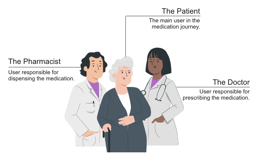
Whilst our focus was on helping patients through the process of acquiring and managing their personal medications, a short brainstorm helped us find a number of opportunities involving other users as well. We decided to anchor the approach around the prescription, and the different human interactions that make use of it. We identified the following major clusters of activity that we felt required deeper exploration.
Each of these activities included a number of potentially impactful problems to solve. With only 10 days available, we focused on a simple end to end user journey for a patient in receipt of a new prescription.
Design Walkthrough
We started out by looking at the existing roll out of digital prescriptions across Australia. The first thing we noticed was a heavy reliance on SMS and email to send each digital prescription to the patient. Putting ourselves in the patient’s shoes, we wondered what it might be like to manage different prescriptions and their renewals over time. Would they really be able to find the prescriptions they needed when at the chemist? How would they know when a prescription was about to run out, without having to spend time going back into each prescription one at a time.
We imagined what it might be like if patients had a better way to manage and use their prescriptions. What if those prescriptions could be managed in one place, and could integrate with search, scheduling and reminders?
Here are our design concepts, and the considerations that helped us bring it to life.
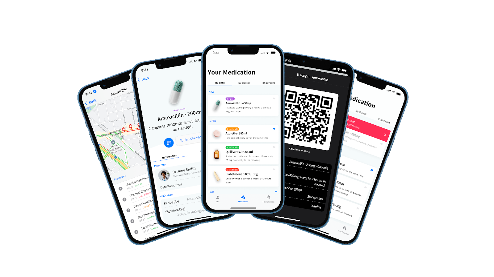
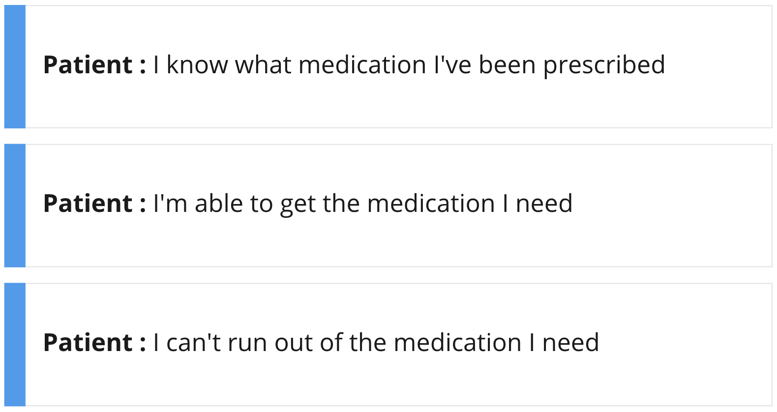
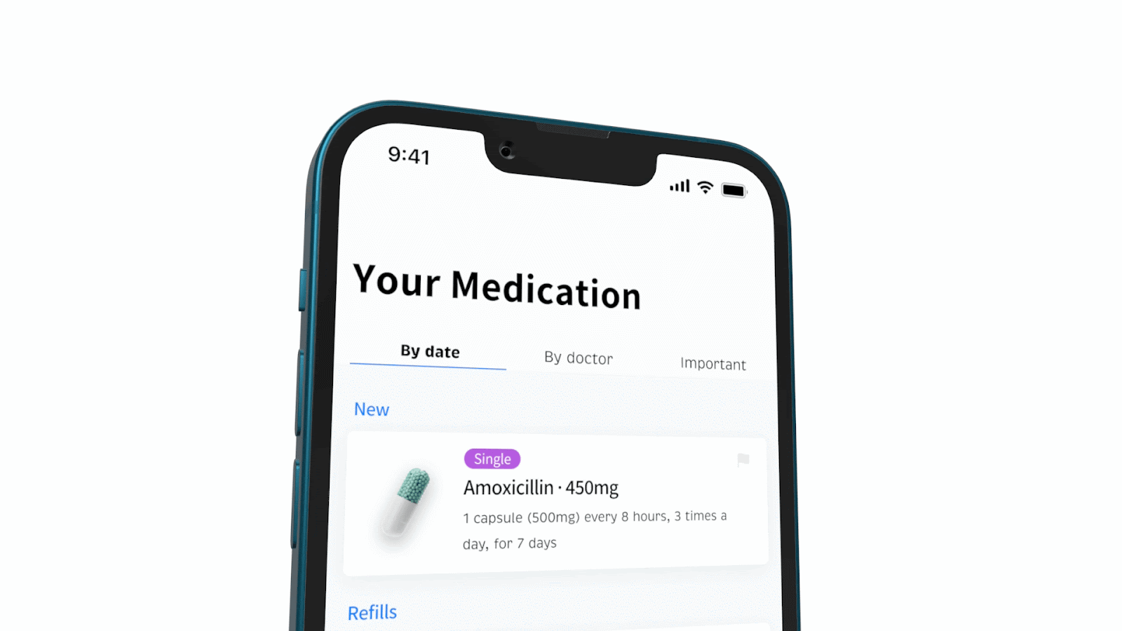
Step 1 – “I know what medication I have been prescribed”
The first step to being able to make use of a digital prescription, is knowing what medication you have been prescribed. We wanted a solution that solved the problem of quickly identifying a single script amongst many.
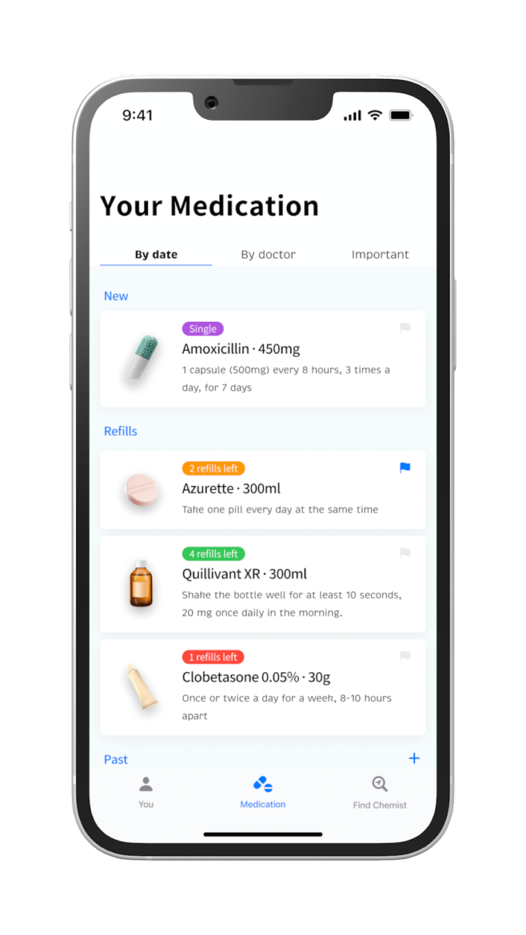
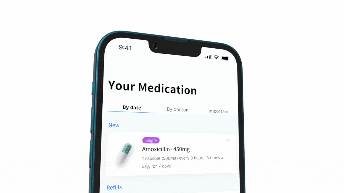
Our first shift was to expose the contents of each prescription, and make visible the key information patients needed to know when trying to understand what medication they have been prescribed.
- What medication have I been prescribed?
- What do I need to get more of?
Whilst it would be nice to show how many pills a patient had left (possibly by integrating with the Medications scheduler or introducing smart bottles), we decided to focus on the number of refills.
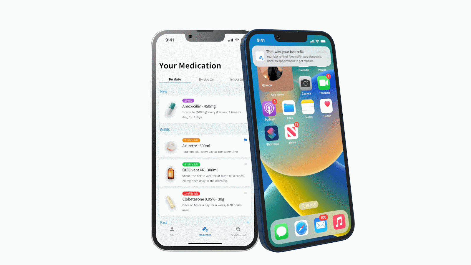
We also decided to add some visual cues to make it easier to review medication, including images and colour coded labelling to draw attention to the medication that would be running out soonest. Instructions on how to take medication were also added so that patients could get an idea of how much they should be taking (and how long each refill might last).
Depending on how individual patients would remember and navigate their prescriptions, we included optionality to search by date, by doctor, and by medication deemed critical e.g. heart drugs could be labelled critical as compared to other medication.
Step 1, part 2 – “A quick look inside each prescription”
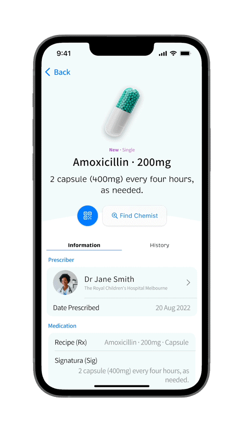
Whilst we had already solved the underlying problem of knowing what medication you had been prescribed, we also wanted to clarify what patients would be able to see within each individual prescription. As we explored this screen further, it also provided a very useful launchpad into our search feature, enabling us to defer the problem of searching for multiple medications in one go.
This screen needed to answer a number of possible questions:
- What is this medication?
- How do I take it?
- When did I last fill the prescription?
We also included a link to search for a chemist that could dispense this medication.
Step 2 – “I’m able to get the medication I need”
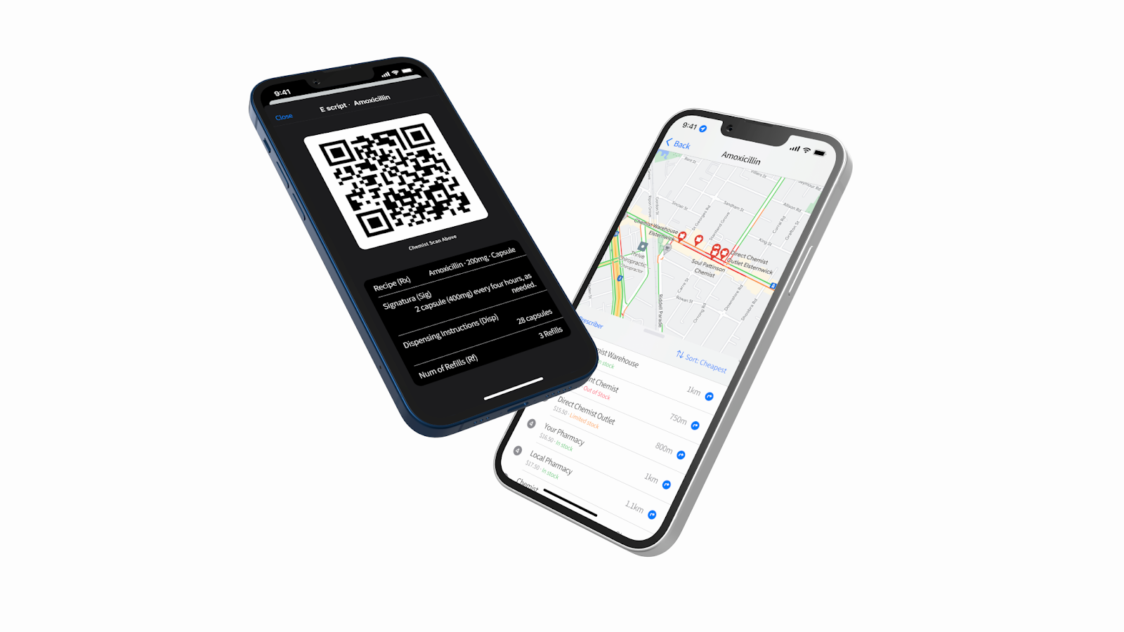
Once the patient knows what medication they need to get, their next task is to find a chemist that can dispense it. We decided to integrate with map based search, initially on a per medication basis.
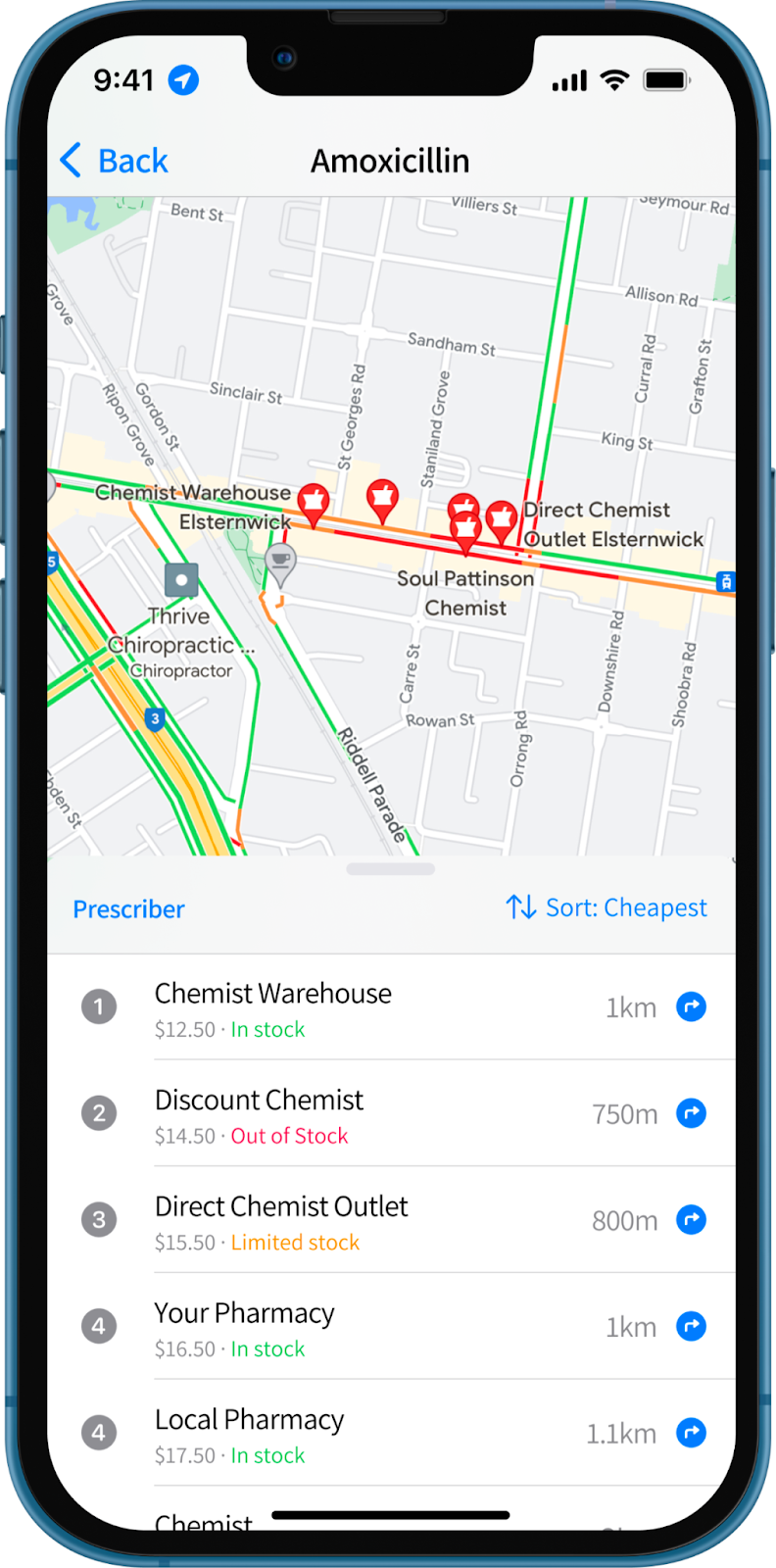
As well as showing physical location, we also thought it would be useful to identify price, and whether the medication was in stock. Both would require access to pharmacy data, which would be a problem for a future iteration.
Step 2, part 2 – “I can get my prescription filled”
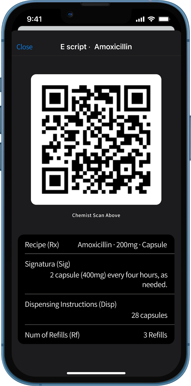
There is quite a bit going on at the chemist including presenting the prescription, payment, marking prescriptions as dispensed and reviewing dosage instructions. Leveraging the digital prescription’s use of tokens/QR codes we decided to add a section on dosage instructions, along with key information such as prescription date, number of refills, and the name of the medication being prescribed.
We also decided to use a black background, to make it clear that the patient should hand the screen over to the chemist at this point.
Further iterations on this design might explore ASL integration and opportunities to dispense multiple medications in a single transaction.
Step 3 – “I will not run out of the medication I need”
The first step in not running out of medication is knowing when your prescriptions are about to run out. Instead of relying on the patient’s memory to request a renewal, we made use of alerts and visual cues to let the patient know when prescriptions were due for renewal.
We wanted patients to have plenty of warning when prescriptions would need to be renewed. Key information on how many repeats are left, with traffic light colour coding, is shown as part of the central dashboard. We also envisaged using alerts at key intervals, particularly for critical medication.
Step 3, part 2 – “I can renew my prescriptions easily”
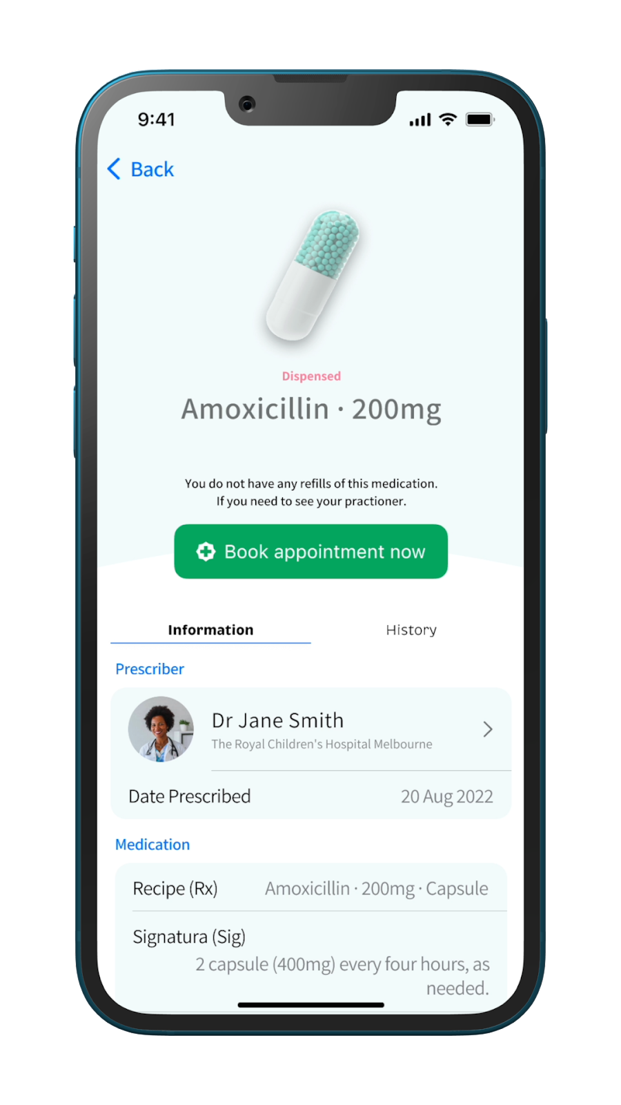
Digital scheduling applications, like HotDoc, are becoming more widely used, providing an opportunity to simplify the patient workflow, enabling them to book renewal appointments directly from their prescription.
We chose a simple booking button from within the prescription view to do this.
Also shown here is related information about the prescribing doctor, and access to a historic view of the medication for the patient in the event that they need to know about past prescriptions and dispensing activities.
Unmet Design Challenges
End to end management of prescription medication is a complex and fragmented area with multiple design challenges. In this sprint, we focused on the most critical parts of the customer journey.
In the next phase of discovery, we would look to solve some other critical design challenges including:
Multiple medications
How to handle prescriptions with multiple medications, search for multiple medications, and dispensation of multiple medications in a single transaction
Home delivery / online payment
How might we enable home delivery options for convenience?
Scheduling
Are there more intuitive and accessible ways patients can manage their medication schedules?
Security/Identification
How can we use built in mobile technology to identify an individual to fill the script?
Shared Access
How can a patient share their scripts, allowing a family member/carer/power of attorney to fill it on their behalf?
Equality of Access
How might non-iOS patients also get access to these services?
The co-emergence of these health technologies and services have the potential to have positive impacts on the way we get and manage our medications, but they also come with significant risks that need to be carefully considered.
Even a relatively small space like prescription management has a mountain of edge cases and complexity involved. More work is needed to understand and address these fully, but this short exploration showed many opportunities to improve patient, pharmacist and healthcare professional experience, which we believe could have positive impacts across the broader healthcare system.
But with time and the right attention paid to removing fragmentation from the user experience, it could be a truly transformative application for users.
If you’re also passionate about human centred design, please get in touch with Mantel Group to explore how we can work together to improve digital experiences for customers.
