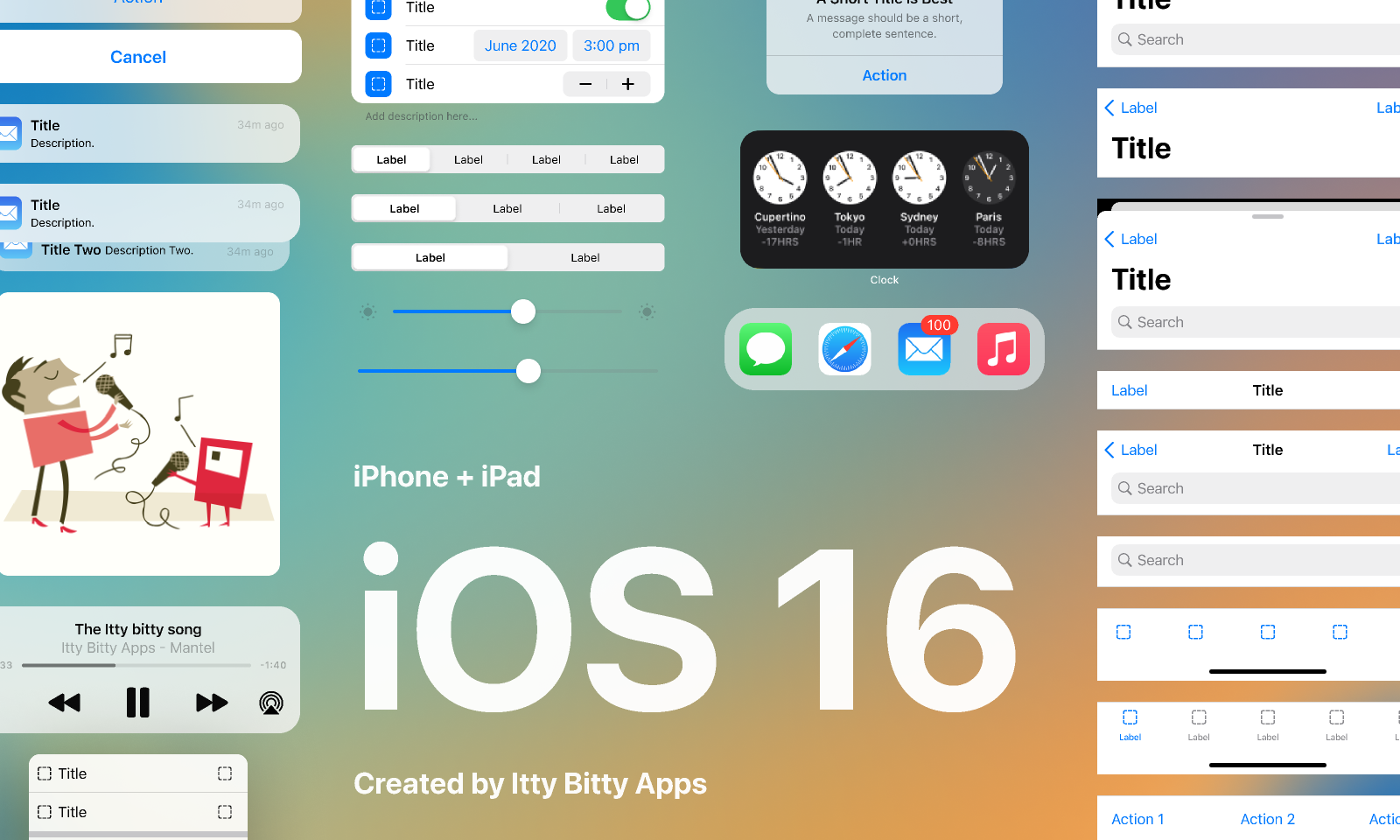
We built an iOS 16 UI kit for Figma🎉 But why build this kit, and what makes it stand out from the other iOS 16 UI kits in the community?
Not to be confused with Apple’s UIKit, a designer’s UI kits provide a collection of elements and styles that allow us to deliver faster and at scale while maintaining consistency. In order to help designers deliver familiar and coherent experiences on iOS, Apple provides libraries and templates for Sketch, XD and Photoshop but not Figma.
As our name hints, at Itty Bitty Apps we design and build mobile apps, so having access to an iOS UI kit is crucial. As a design team, we chose Figma as our primary design tool for many reasons that could fill their own blog post, but since Figma isn’t getting any love from Apple we decided to fill the void.
There are other iOS 16 kits available in the Figma community, but our team always felt these kits could be more user-friendly and complete. We needed more detail, flexibility and comprehensiveness. By creating our own, we set out to expand and improve on many of the deficiencies we saw in the other kits.
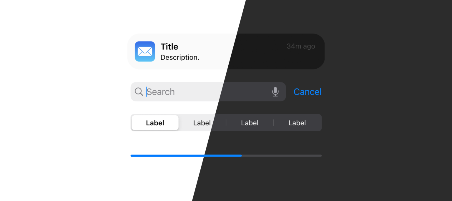
Properties for customisation
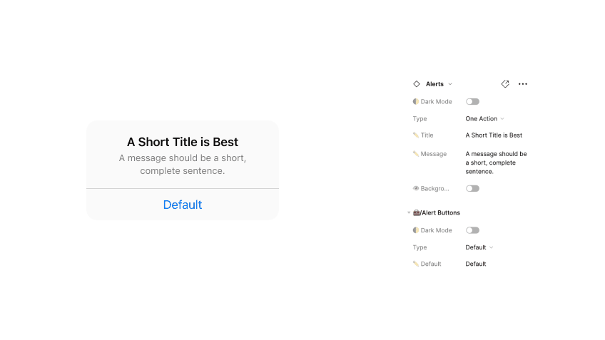
iOS components consist of a lot of customisable parts. For example, text, labels, icons and layouts can be disabled, moved or removed completely. We designed our kit to allow users to make the majority of editable customisations within the properties editor without the need to detach or break the component. Making changes manually to customise components can be time-consuming and can lead to designs which don’t follow guidelines. The detailed properties help designers work faster and follow Apple conventions.
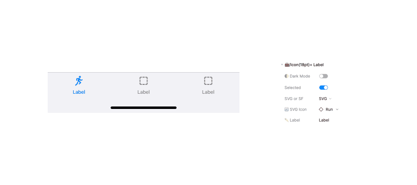
Support for multiple icon formats (SF Symbols and SVG 😱)
When incorporating icons in our designs it is common to use SF Symbols, SVG icons or a mixture of both. It can be time consuming to create or modify components to support these formats. Our kit supports both SF Symbols & SVG icons and enables switching between them within the properties editor. This gives designers the flexibility to choose the format that best suits their needs without editing the components themselves.
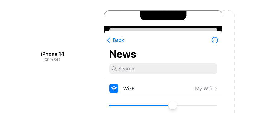
Adjustable to any screen size
Over the years, Apple has released 38 iPhones with varying dimensions. Just the latest iPhone 14 comes in three different variations! The components need to be flexible and resizable to support all these screen sizes.
In our UI kit, you can resize components simply by manipulating their dimensions, and all the internal content reflows automatically.
Changing between Dark Mode & Light Mode
Since iOS 13, supporting light and dark modes has been a critical consideration when designing mobile apps. Creating these alternate screens has always been a time-consuming process.
Our UI kit components have a 🌓 Dark Mode toggle that changes the UI between the two modes, freeing designers to focus on building the UI, not what presentation mode it is in use.
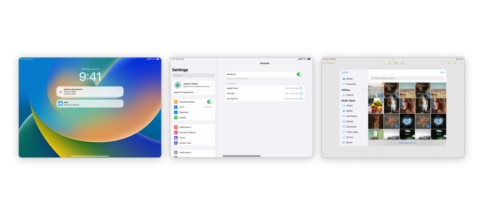
iPadOS
While there is an abundance of iOS UI kits in the Figma community, iPadOS UI kits are hard to come by, so we included iPadOS components in our kit! Although the two operating systems have similar UI styles, iPadOS has different capabilities and considerations. For example, some components have a different layout, some components are unique to the iPad, and most have an extended width. Having tailored components specifically for the iPadOS platform will help designers create iPad designs faster while following Apple conventions.
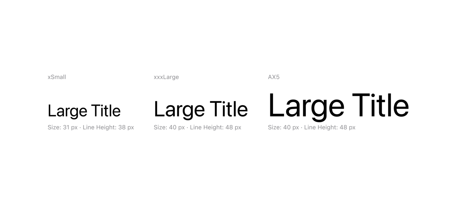
Dynamic Font Styles
Accessibility is something every designer should consider and include in their mobile app designs. In our UI kit, we’ve documented the accessible colour and dynamic text styles, showing all the different colour variants and text sizes used in iOS. We have also included a range of dynamic font sizes and colours as Figma styles that designers can easily apply to elements.
Accessibility tends to be forgotten or pushed aside because it can be difficult and time-consuming to find, understand and implement the appropriate settings. This will help users to modify their design and see how it might look under specific accessibility settings.
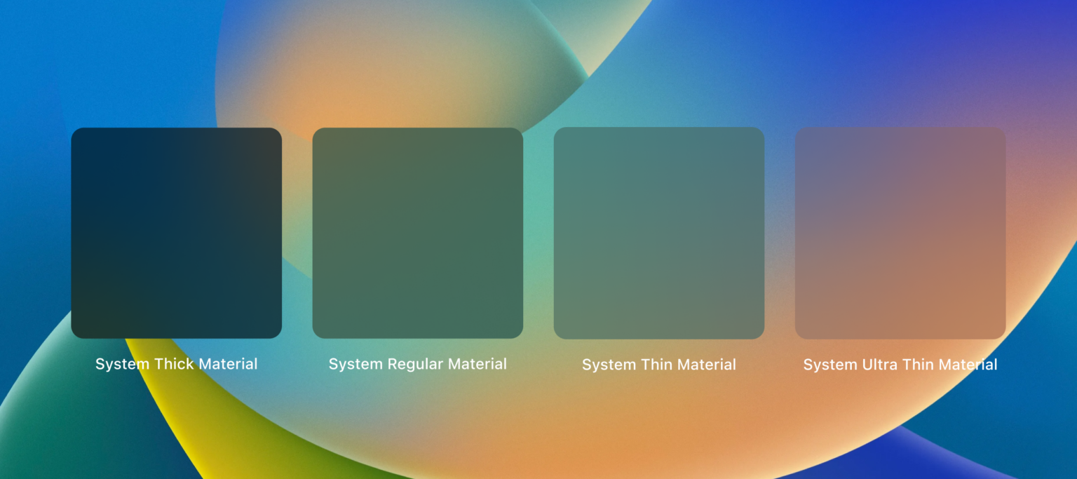
iOS Blur Effect
Our kit provides System Materials Background, which has four different settings — SystemUltraThinMaterial, SystemThinMaterial, SystemMaterial and SystemThickMaterial. It can be hard to recreate these styles if the colour and blur settings are unknown. So our UI kit provides colour and blur styles that can be combined to recreate the four pre-set styles as closely as possible in Figma.
We built this UI kit because we wanted something better. We wanted a kit that made it faster for us to create accurate and flexible designs for both iOS & iPadOS. We also wanted to contribute to the community by releasing it free to use under the Creative Commons license.
We’ll keep this kit updated as iOS and iPadOS evolve, but if you have any ideas or suggestions, feel free to comment on our Figma page or email us directly, we’d love to hear from you!
