
Published May 10, 2021
Written by Camila Carvalho
We engaged with one of the leading private hospitals in Australia to develop a financial reporting dashboard across the hospitals and wards, supporting the decision process to optimise workforce.
The situation
To help optimise rostering and ensure that hospitals are operating efficiently, a leading private hospital provider embarked on a consolidated data driven approach to decision making and monitoring.
The objective of this project was to prove out that this monitoring can be stored and reported for all types of wards in a single consolidated location where different users who require information for different reasons can use this data and use it to support decision making.
The approach
Our approach focused on introducing some fresh, innovative ideas to address this situation, backed with modern, cloud technology and an agile way of working.
Core to our technical delivery was uniting streams within the organisation together to collaborate on the project, working with the business, IT, quality, finance and data teams to deliver the project. Critical to the project’s success was engaging senior stakeholders early.
Following this, the initial kick off was with the CEOs of the hospitals. We spoke to them on what they currently report on the types of the problems they currently encounter with their reporting. We then spoke to other stakeholders in the business to understand other reporting requirements and other problems wards would like to report on.
The solution
The solution was a consolidated Power BI report which would become a single source of truth for everyone in the business to view this data. Each page of the report would answer a different question to the business and provide users with different perspectives on what good looks like.
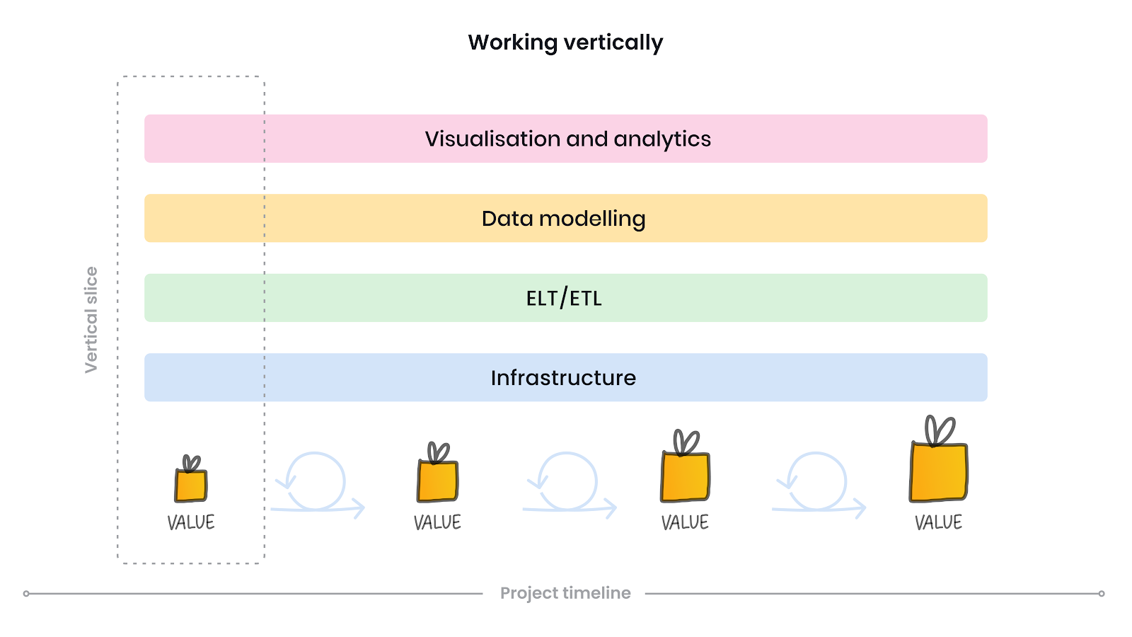
To prove this solution was feasible the development team targeted visualising this data for standard wards within the hospitals. This was done to see if this workflow and solution would be suitable for the use of CEOs, Directors of Nursing and Nurse Unit managers or if the solution would need to be different for each user group. As shown below we conducted a thin slice of the entire end solution which encompassed everything the end solution would entail but just for the one use-case allowing end users the ability to use the solution quickly.
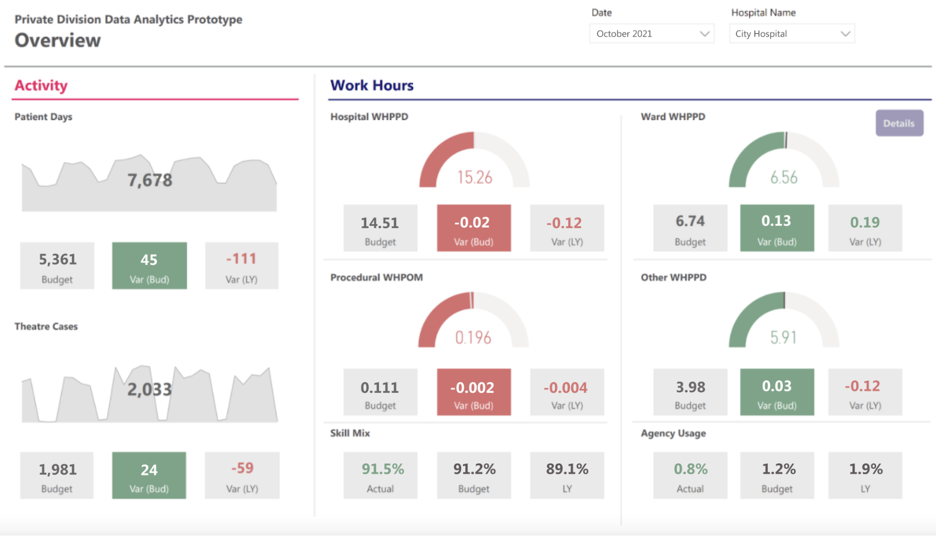
Dashboard | Overview page
The overview page is designed for CEOs of hospitals to quickly understand the current and historical performance of the hospital and how it is compared to budget. This is done by showing key metrics that show Hospital Activity and Work Hours related performance indicators.
The metrics are all colour coded to show if they are above or below expected budgets to aid CEOs in quickly understanding if they are on target with their budgets or if they have gone over budget. This can be shown for each individual hospital or can be shown for the entire hospital portfolio. The key metrics that were identified to help measure performance for standard wards was work hours per patient day which helps show how work hours of nurses compares to the patient days of treatment provided. As labour is a primary cost factor to private hospitals, this metric is a key indicator for understanding if the hospital is providing efficient care.
For this we do not want this number far below the expected budget as that could indicate less than satisfactory care provided to their patients. If this measure is unfavourable to budget, there could be a number of reasons why this could happen and the CEO might talk to the Directors of Nursing to understand this or investigate it themselves.
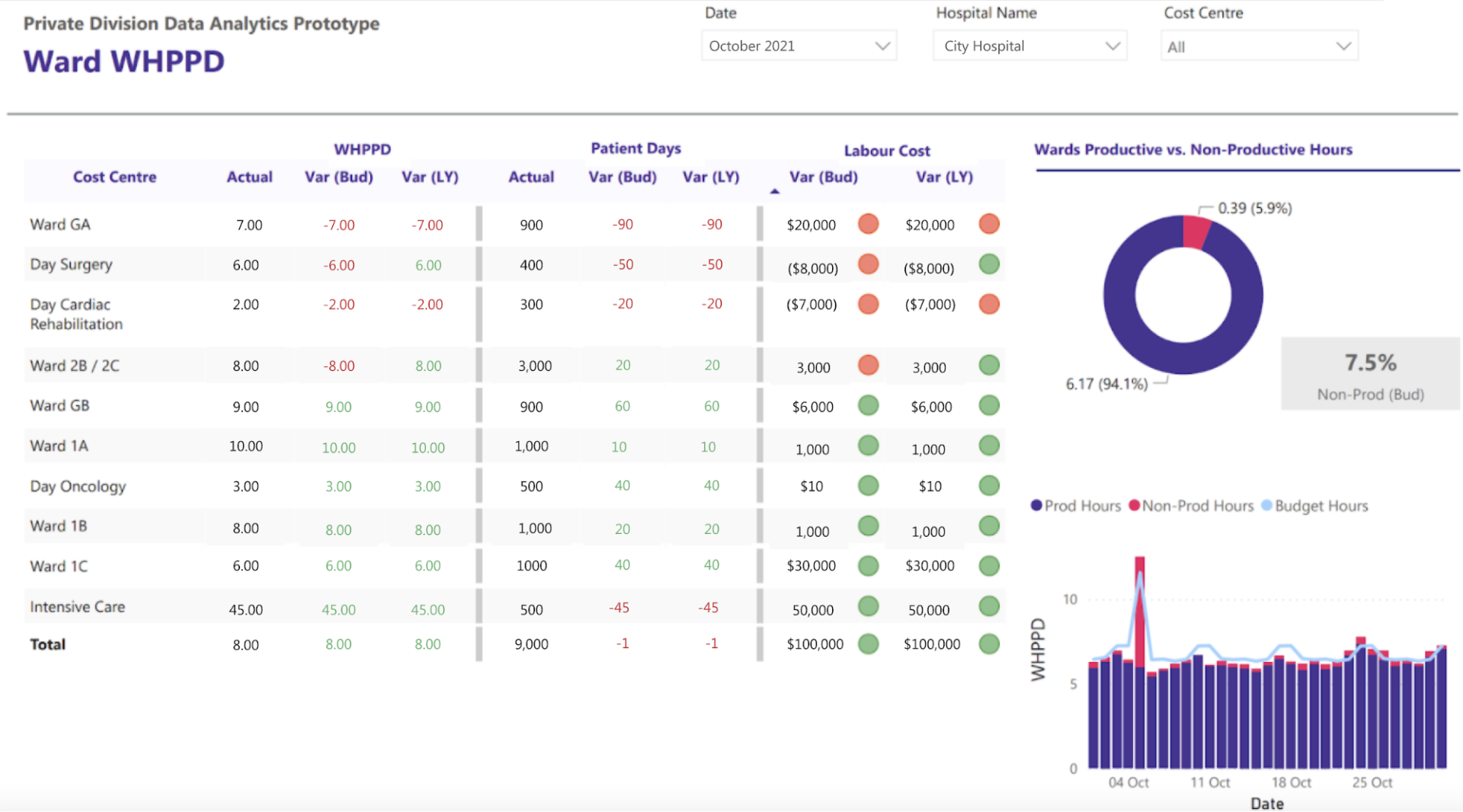
Dashboard | Ward drill down page
To help understand why a hospital may not be running efficiently the next page is a the Ward drill down page is meant to help answer these questions. The Ward drill down page has been built to be accessed by Directors of Nursing and provides them a streamlined view of how different wards in the hospital are performing. It quickly shows which ward has the highest negative variability from budget and if this is due to the patient days being lower or if it is because the hours worked is too high.
A good example of this can be seen in the example report where we have the Ward GA which has the highest variance from budget labour cost by $14,000. Using the table we can also see that since the Patient days is 68 patient days below budget that patient activity is the primary factor for the decrease in WHPPD.
There is also supplementary information which shows if non-productive work hours is a factor in this and we can see that around the 5th there was a massive spike in non-productive hours.
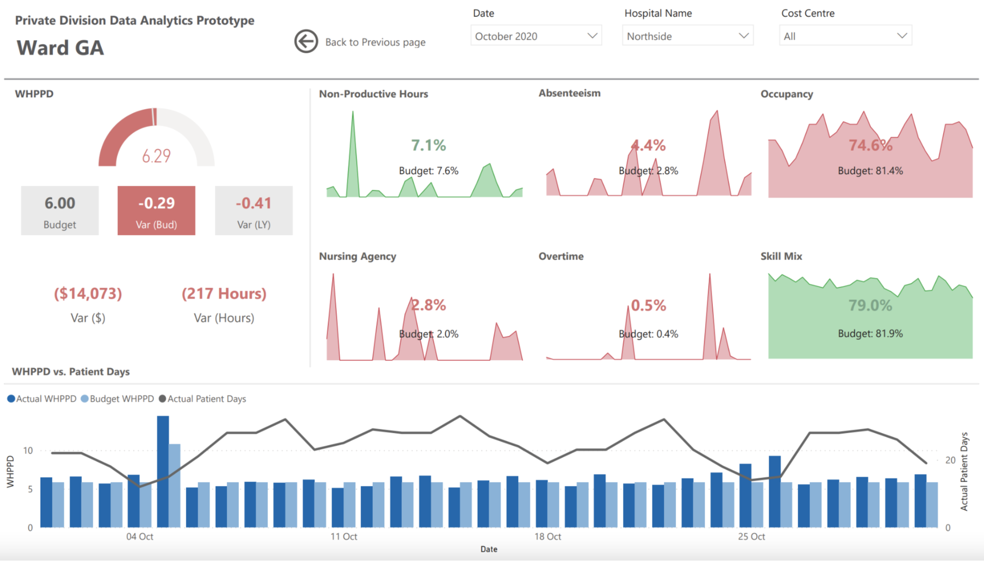
Dashboard | Single ward drill down page
This final page filters down on a single ward. At this stage in the user journey, we have identified that a specific hospital has gone over budget and has a higher work hours per patient day. We then looked deeper to the detail and found that it does not seem to be a hospital wide problem but a specific ward, this would be the next place to look to understand why this ward has gone over the expected budget.
The page shows 6 key key metrics, 3 relating to rostering and workforce and 3 relating to the mix of workers performing the care. The main users of this page would be the Nurse Unit Managers who like seeing more detailed information. They would be looking to understand what is causing inefficient care and what can be done in the future.
What we can see from this page at a glance is that this ward Non-productive hours and the Skill Mix are favourable to budget while also seeing that occupancy is down. This provides users with a quick visual understanding of how efficient the care the team is providing but having the ability try and understand deeper if required.
Business outcomes
The key business outcomes is that now the entire organisation has visibility over performance of the hospitals. If there are any identified issues, there is now a clear pathway to understand the cause of these. The creation of this report also becomes fully automated with the reports updating daily to reflect any updates to the budget.
Another key business outcome is that now that the logic and data is all consolidated and being sourced from the same location, there should never be a misalignment of information. The CEO of the hospital will be seeing the same information that the Directors of Nursing and the Nurse Unit Managers are seeing.
This will also take effort away from the analytics teams in these hospitals and the staff can receive this information without any manual intervention.
Thank you to my colleagues Naunghton Williams and Sommer Deo, who assisted in delivering this work and writing this case study.
