Published November 11, 2021
Written by by Cael Degnian
We engaged with one of the leading aged care providers to develop a SQF reporting dashboard across the operations platform and integrated the insights into staff workflows.
The situation
As part of their commitment to driving better quality outcomes and resident care, a leading Aged Care provider embarked on a data driven approach to quality in line with the Single Quality Framework (SQF).
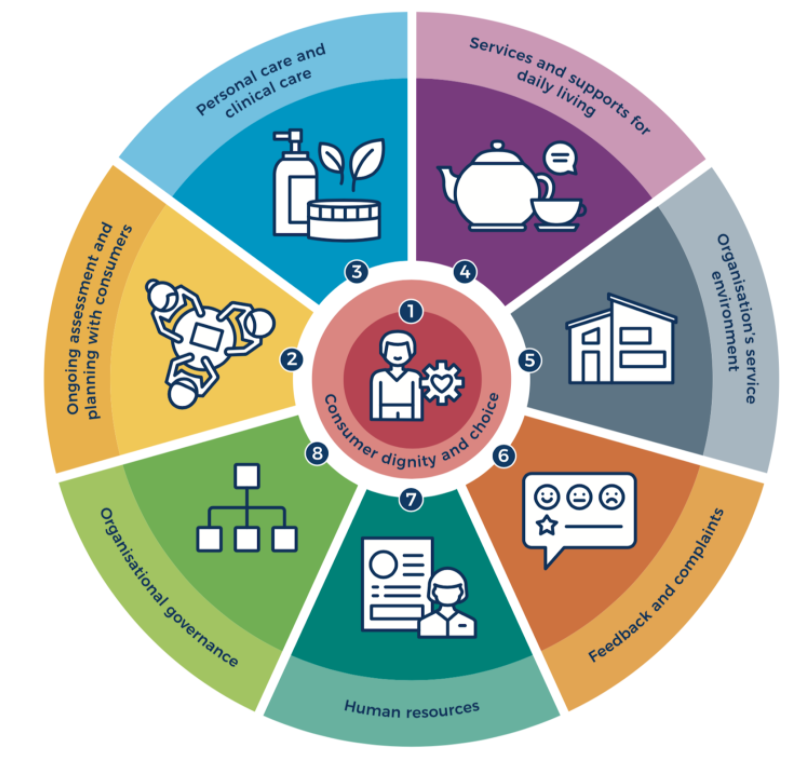
The objective of this project was to gain a deep understanding of the providers real time risk profile against the Royal Commission’s 8 core SQF reporting standards, and to integrate those insights into staff workflows to support improved care delivery.
The approach
Our approach focused on introducing some fresh, innovative ideas to address this situation, backed with modern, cloud technology and an agile way of working.
Core to our technical delivery was uniting streams within the organisation together to collaborate on the project, working with the business, IT, quality, finance and data teams to deliver the project. Critical to the project’s success was engaging senior stakeholders early.
Following this, the initial project discovery sprint kicked off, working to gain a deep understanding around the current data landscape within the organisation. A key part of this was mapping processes within the organisation (eg. care plans, incident management) to data sources and assessing these based on access, availability, value and relevancy against the 8 SQF standards. As an output, a catalogue of agreed and prioritised metrics was developed to inform the dashboard development.
The team united around developing an SQF dashboard; a suite of metrics that highlight the organisation’s risk profile, as well as ongoing performance and continuous improvement outcomes against the Aged Care Quality and Safety Commission Standards.
This is made up of eight parts aligned with the 8 SQF standards.
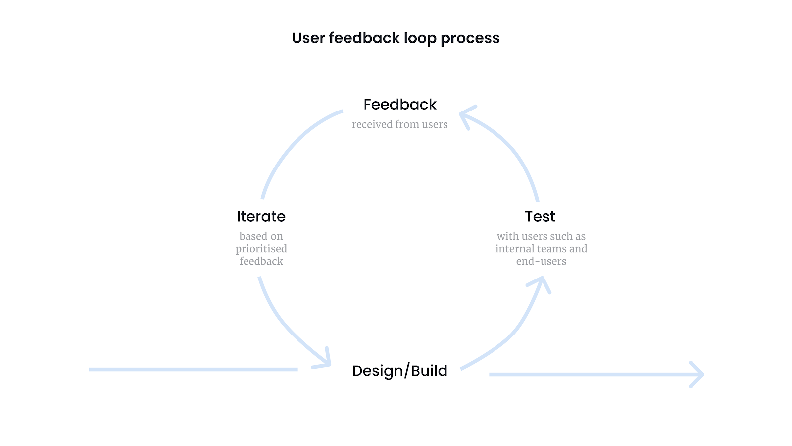
True to our agile roots, a tight feedback loop was established to unite stakeholders in solving a common challenge. In partnership with the providers quality team, syncing intra-day we worked to embrace change, and re-prioritise the plan throughout the delivery plan to maximise value for the end-users (including the quality team and managers at various levels).
The ability to action feedback and create continued value along the journey was key to landing on a solution that ultimately became embedded into the workflows of all stakeholders across the organisation.
The solution
Real time performance against SQF reporting standards
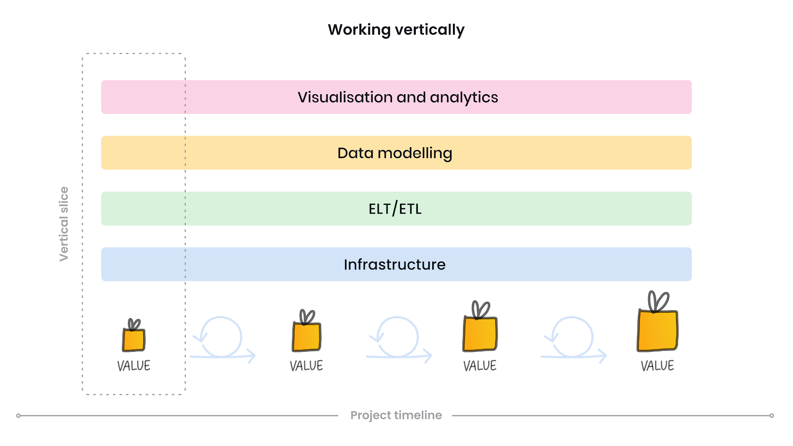
With an agreed prioritised backlog of metrics, we embarked on a delivery phase focused on development of vertical slices across the tech stack to maximise value for our end-users throughout the project.
It’s often tempting to work horizontally in dashboard development, trying to finalise the data ingestion layer before moving onto the scripting for all data sources and metrics, and only then starting to develop the dashboard. The end-users only see the dashboard, so they don’t realise value until the end phase of the project. By slicing the project vertically, we’re able to create a tight feedback loop with our users as they are seeing tangible value in the dashboard during the entire delivery cycle and have a chance to provide feedback throughout.
A final output of the project was a Power BI dashboard, deployed within the provider’s existing Microsoft technical ecosystem. The dashboard offered 2 views for the user; an overview and comparison. For the purposes of data privacy, we have used dummy data and a fictional organisation in the below dashboard examples.
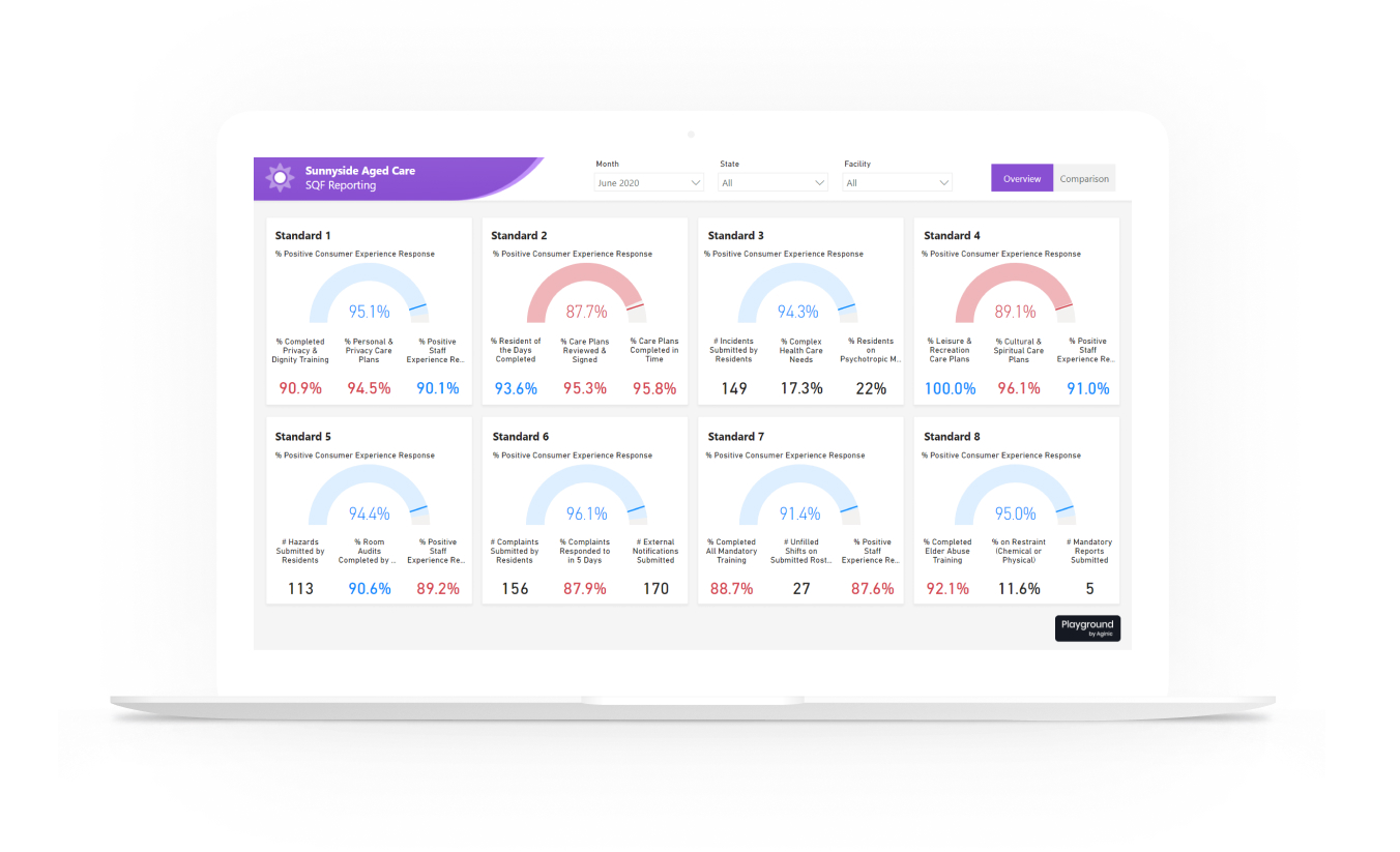
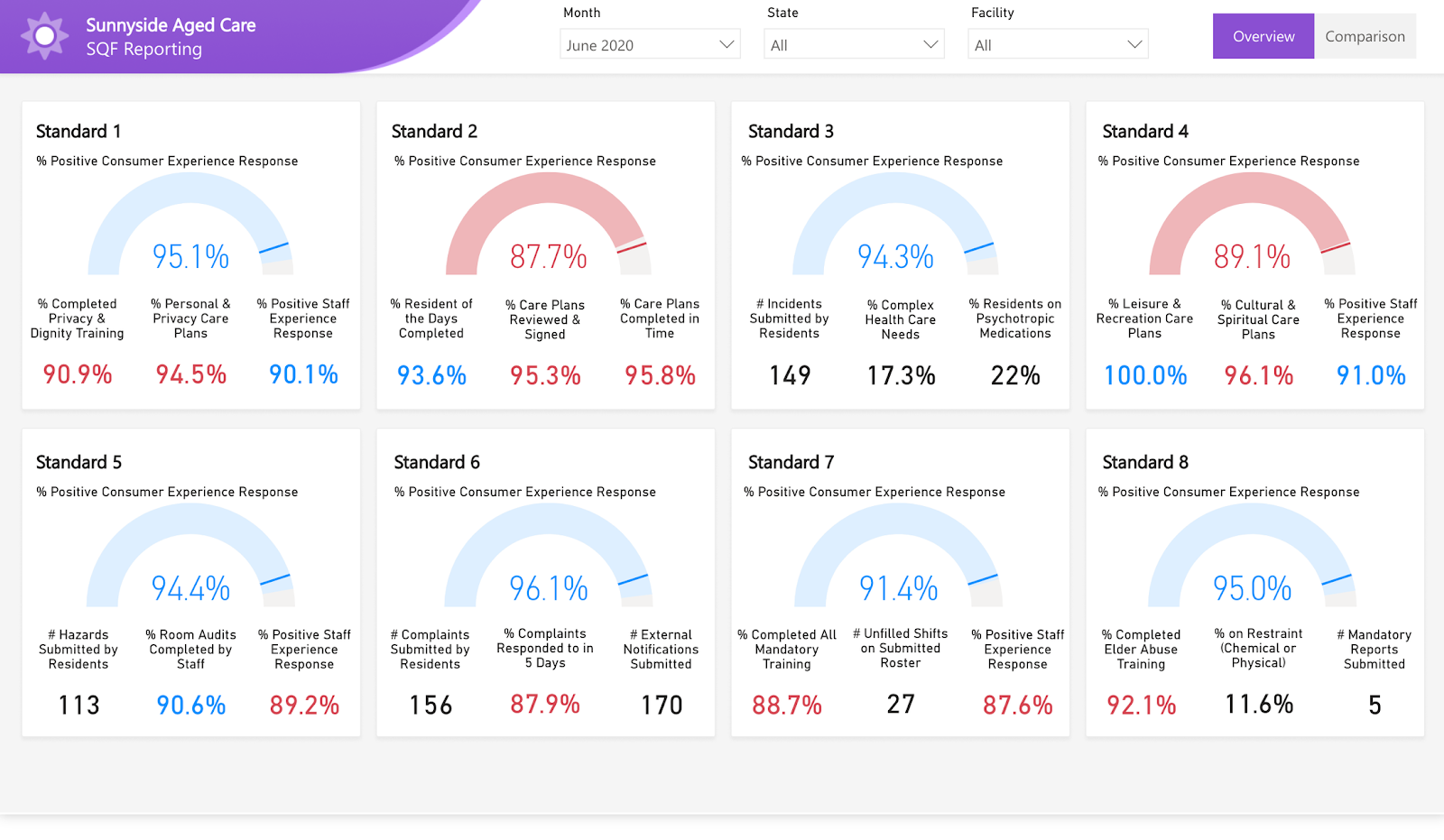
SQF dashboard | monthly snapshot
View interactive dashboard in Playground by Aginic
The overview allowed users to see a quick snapshot by month, of their performance against metrics aligned to the 8 SQF standards. Results were grouped at a facility, state and organisation level.
Each standard occupies a section within the dashboard linked to the SQF reporting framework, totalling 42 indicators (sample subset of metrics above).
The tool primarily incorporates measures of consumer experience as well as care plans, mandatory training modules, incidents and hazards, pastoral care visits and more. Information can be filtered down to a particular facility and reporting month. The team leveraged pre-existing technical infrastructure and data from a broader data platform project, encompassing a suite of reporting across the wider providers group level, leading to faster and more efficient deployment of the reporting solution.
SQF dashboard | portfolio comparison
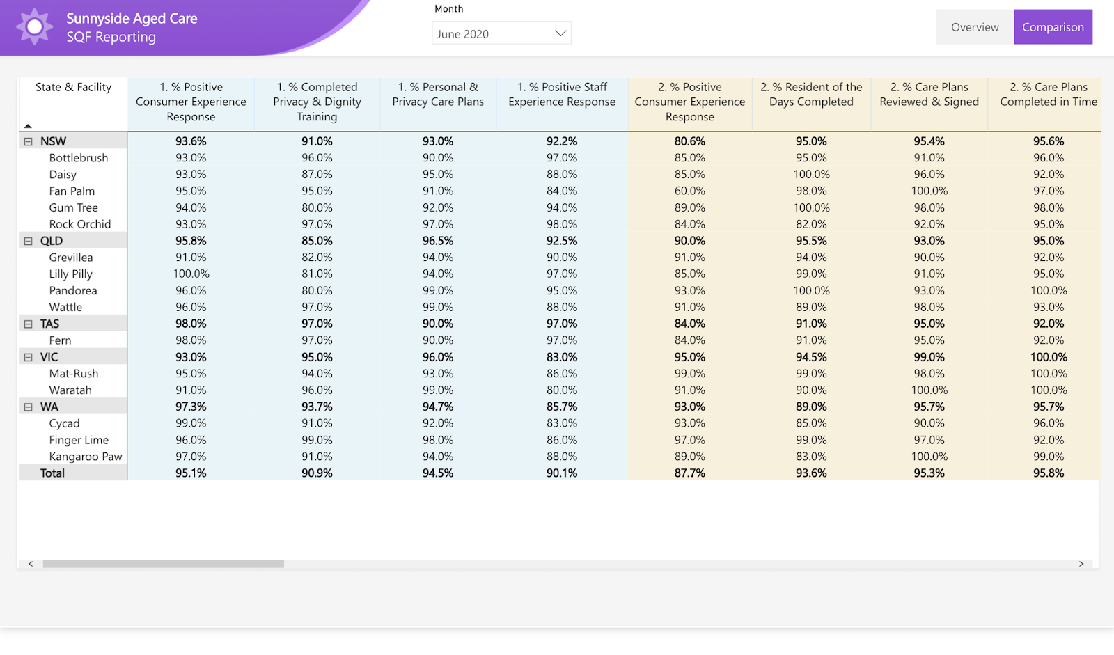
The comparison report offered a 1 page view across all facilities and metrics to highlight learning opportunities for those facilities with a lower risk profile than others. It also allowed a quick snapshot into the gaps where data hasn’t been collected for that particular facility or month. Creating this feedback loop is crucial to engage with users, as they can now clearly see the impact of accurately recording vital data points as part of their daily processes.
Business outcomes
Mantel Group successfully built and deployed the SQF reporting dashboard across the providers operations platform, integrating the insights into staff workflows to support improved care delivery. In this case, the dashboard was embedded into the manager’s existing SharePoint environment, which is used as part of daily BAU and as a key tool in their regular manager meetings.
Throughout the project, a variety of technical and cultural transformations were realised, including:
- A recognised shift in organisational behaviour becoming more ‘data-led’
- Empowering managers at all levels to make data-driven decisions
- Developing the capabilities and insights to make informed decisions in the moment, with no reporting lag
- Harnessing the broader organisations brain power to contribute to the data-led approach
- Improved platform governance, management and security, especially around identifying trusted data sources and agreed organisational-wide KPI definitions
Currently, the SQF reporting dashboard is available to over 20 facilities across Australia, accessed by facility managers, state managers, executives, reporting teams and front line care providers.
The project has led to a variety of other data transformation initiatives for the organisation.
Feedback
”These reports are also refreshed daily and automatically, sometimes even a couple of times a day. This type of overview is priceless from a care perspective; drilling down into each standard, and enabling us to improve upon our work for the community now, and into the future.”
”The Dashboard was originally designed as a response to the aged care commissions refined standards that came into effect in January 2020. This tool assists state management teams and executive staff members with their risk profiles against these eight standards, and indicate what actions can be taken to mitigate issues down the line.”
