Published June 8, 2022
artisan is a not-for-profit organisation that engaged with Mantel Group to effectively measure the social and financial impact of their marketing efforts. Our solution, a social media and sales dashboard, helped the marketing team at artisan to make data-driven decisions on what events, products and creators to promote.
The situation
artisan engaged with Mantel Group to effectively measure the social and financial impact of their marketing efforts. The organisation’s marketing efforts are directed toward building financial stability for their creators, and increasing their impact on the broader Queensland craft community.
Our approach focused on creating a digestible format of the different sources of data and providing functional metrics for the marketing team at artisan. The solution we provided was a Power BI dashboard, which is an aggregated and intuitive view of the various social media and marketing data sources. Collating from both their sales platforms and social media channels, including: Shopify, Eventbrite, Facebook and Instagram, we synthesised their data into actionable insights.
Our approach
Our engagement started by applying design thinking concepts including empathy mapping and iterating on low-fidelity prototypes prior to technical development. This approach ensured we were identifying key pain points and iteratively validating the solution to the problem.
We used our industry expertise to identify common business problems prior to our initial engagement and we used workshops to validate our assumptions with the client. We scoped out the primary pain points of artisan, assuming the challenges most businesses face when collecting data from multiple sources and mapping them to their key business objectives.
After our initial workshop, we validated that the core problem for artisan was: “How can we make informed marketing decisions to strengthen the financial return of our makers based on the engagement and sales data from our platforms?”.
Using this as our vision, the Mantel Group team drafted low-fidelity prototypes using Figma. We presented our key findings for feedback from the artisan team and we were able to do a few iterations offline to come to the result that would best suit artisan’s needs. The key to our success was being able to iterate quickly on how to best represent the performance of marketing efforts whilst simultaneously developing the backend solution to bring the necessary data in for the social media and sales dashboard.
Mantel Group then finalised a hi-fidelity prototype, which was productionised in Power BI. artisan assisted Mantel Group in refining the details after playing with the data in Power BI to help them best address their core problem.
The solution
The final dashboard combines all required information in three pages, grouping the key results in a summary page and the two other tabs focusing on the specific areas of work: events and products.
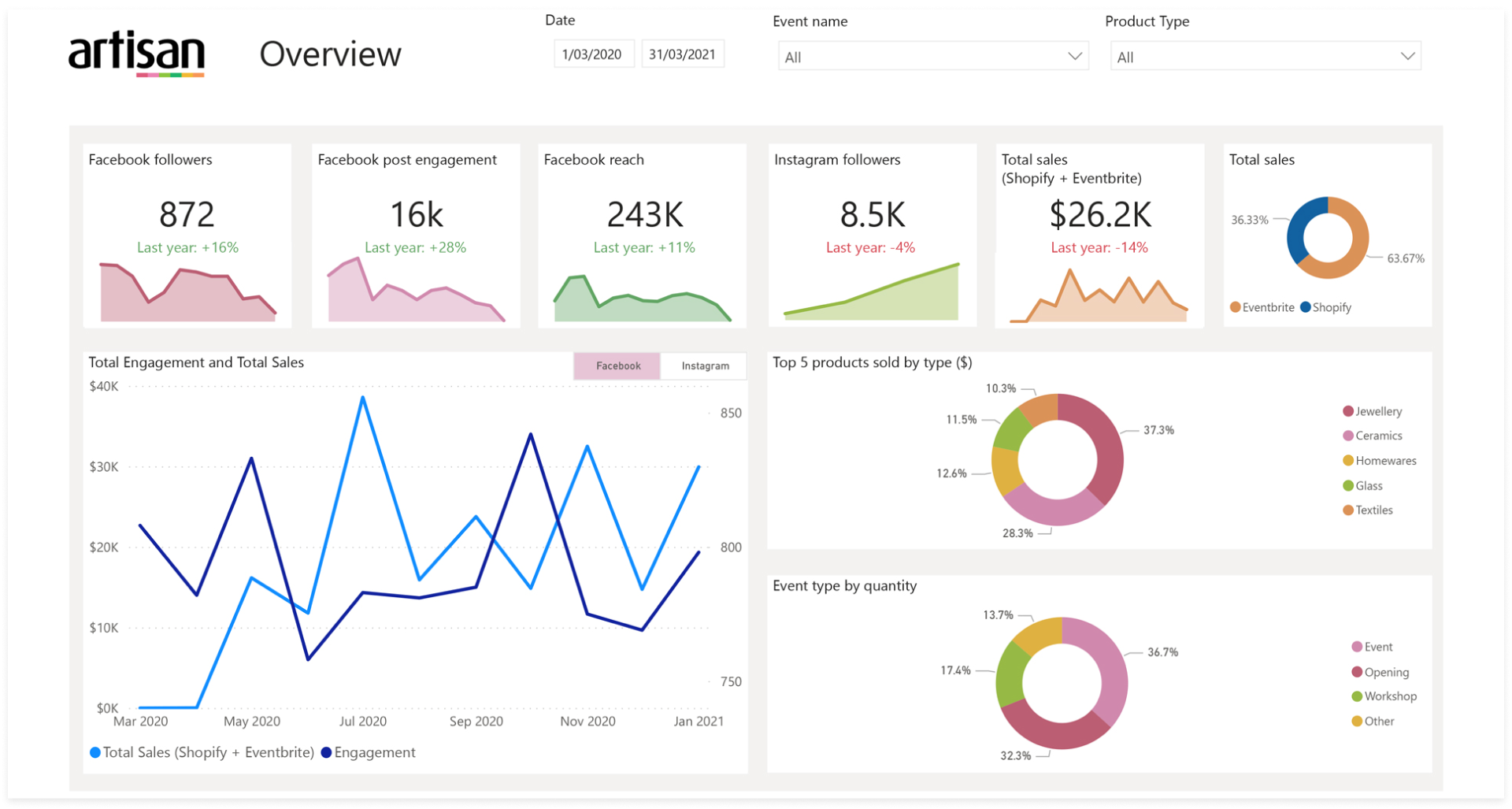
Sample of Dashboard with mock data
The overview page provides a snapshot view for artisan of all their data sources, how social media channels are performing overtime, and the best selling products and events. The data sources combined in this dashboard included Eventbrite, Shopify, Facebook and Instagram in a basic data pipeline with transformations done in Power BI and data stored in Excel. The next step would be to automate the data pipeline by using technologies such as Azure Data Factory to minimise the human intervention needed to achieve the same result.
The top row of area charts displays a metric from each data source overtime and a KPI comparison to last year. Followers and engagement are measured overtime for the social media channels as an indicator of audience health. The data pulled for Shopify and Eventbrite in the snapshot shows how overall finances and event attendance are tracking overtime. This panel acts as a single source of truth for the marketing team.
The bottom left line graph shows a visual correlation of engagement from social media channels to finances from their sales platforms. The question that this answers is if social media engagement can impact the sales of products on different platforms. The marketing team will be able to use the donut charts to make decisions based on what products are currently performing well, to either continue to promote those, or boost less popular product types and see what effect this has. This decision making process will replicate for the events held by artisan.
From the overview, the user can then investigate data and answer questions relating to the facilitators and events data. This view uses the same layout as the overview to provide visual consistency for the user to locate data. The purpose of these metrics is to indicate the financial stability of facilitators and their events. The artisan team can use these metrics to understand how their efforts are impacting the greater community. artisan can also use Power BI filters to cut the data in different ways to report on and understand how individual facilitators are performing.
Business outcomes
The social media and sales dashboard helped the marketing team at artisan to make data-driven decisions on what events, products and creators to promote.
Build financial stability for the creators: Track and report on sales data and audience engagement with social media channels to provide creators opportunities to share and promote their work. The goal in the long-term is be able to correlate sales data and audience engagement after more data collection.
Increase impact of artisan: Track the financial and engagement performance of first nations, rural and young artists. This will allow artisan to quantify their contribution to the State’s cultural and economic future through arts, culture and creativity, particularly focusing on Creative Together 2020-2030.
