
How can we dig insights from a flood of information? With every company now leveraging platforms and tools to run their workflows, data shortage is not an issue and it is easy to export logs of all the different events, steps and timestamps of a given business process. Once those logs are available, it is time to kick off Process Mining!
TLDR;
Only interested in our benchmark of three different tools? Jump to the last section: Round-up, benchmark and selection guide, which includes a section on use cases.
Process Mining in a nutshell
Process Mining is a group of techniques and algorithms used to analyse event logs and drive insights and patterns from data. These techniques can result in many types of visualisations, however, for the purpose of this article, we are going to focus on the output of a Process Map (or Directly-Follow-Graph (DFG)). The output of Process Mining is usually leveraged to understand business processes, assess the deviation of the processes from the intended one, identify specific bottlenecks or get some insights about the performance of each step.
The minimum level of input required to run Process Mining techniques is the following:
| Workflow | Stage | Timestamp |
| 1 | Stage A | 01/01/2019 09:00:00 |
| 1 | Stage B | 02/01/2019 12:00:00 |
| 2 | Stage A | 01/01/2019 09:00:00 |
| 3 | Stage B | 01/01/2019 11:00:00 |
| 3 | Stage D | 03/01/2019 09:00:00 |
| … | … | … |
If you can get your data in the format above, you are all set to perform some Process Mining!
An example of a few Process Mining tools
There are dozens of tools which can perform Process Mining. Here is a brief introduction to 3 of them: PM4Py, bupaR and Celonis Snap
PM4Py
The open-source Python library PM4Py (Process Mining for Python) is focused on allowing users to analyse their process data and generate graphs out of those.
Installing the library is as easy as a `pip install pm4py`. As always, when installing Python libraries, it is usually a good idea to set up a virtual environment, either via python venv or by using Ananconda/conda/miniconda to avoid conflict between packages versions.
Once installed, it is possible to use the package to analyse data from event log files in the IEEE XES format or directly from CSV files and dataframes. A big advantage of using PM4Py is that we can leverage Pandas extensive range of functionalities to import data from different formats, manipulate and clean the data, segment/filter it, or even join different source files. And in conjunction with Jupyter notebooks, the data ingestion process becomes very easy for people familiar with those tools.
On the flip side, we have found that the documentation of the package is being re-written and is currently lacking clarity and examples. We spent a fair amount of time figuring out how to define the relevant columns of our source data for them to be used by the algorithm and realised that the dataframe needed to be sorted by the timestamp column in order for the output to be correct.
Here is an example of how to run the package in a few lines of python code and show the Directly-Follow-Graph (DFG) of the logs extracted from a given process.
import pandas as pd

df = pandas.read_csv("my_logs.csv")

df["col_name_date"] = pd.to_datetime(df["col_name_date"])

df = df.sort_values(by=["col_name_date"])


from pm4py.util import constants


CASEID_GLUE = "col_name_caseid"

ACTIVITY_KEY = "col_name_activitey_key"

TIMESTAMP_KEY = "col_name_date"

parameters = {constants.PARAMETER_CONSTANT_CASEID_KEY: CASEID_GLUE,

constants.PARAMETER_CONSTANT_ACTIVITY_KEY: ACTIVITY_KEY,

constants.PARAMETER_CONSTANT_TIMESTAMP_KEY: TIMESTAMP_KEY}


log = conversion_factory.apply(df,parameters=parameters)


dfg = dfg_factory.apply(log,parameters=parameters,variant="frequency")

gviz = dfg_vis_factory.apply(dfg, log=log,parameters=parameters,variant="frequency")
dfg_vis_factory.view(gviz)
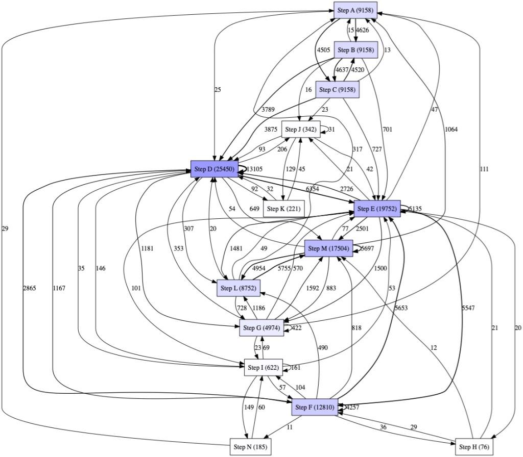
Example of DFG output from PM4PY
When compared to bupaR, we found PM4Py quite scarce in terms of capabilities in the DFG area. It is not possible to simply use the library to pick the top x percentage of traces for example. Also, bupaR offers more visualisations like the ability to draw Precedence diagrams.
Saying that, because the library relies on standard Python data structures, it is possible to manipulate those to achieve more tailored results. The following example uses the same data as the previous one but filters out some links and only keeps links between states when they occurred more than 50 times:
log = conversion_factory.apply(df,parameters=parameters)


dfg = dfg_factory.apply(log,parameters=parameters,variant="frequency")

dfg_filtered = {x : dfg[x] for x in dfg if dfg[x] > 50}


gviz = dfg_vis_factory.apply(dfg_filtered, log=log,parameters=parameters,variant="frequency")

dfg_vis_factory.view(gviz)
Finally, it is possible to integrate PM4Py visualisations in Power BI Desktop by installing the library locally. But because the package is not yet available in Power BI Service (list of Python packages here), it is currently not possible to publish Power BI reports or dashboards using graphs generated from PM4Py.
bupaR and processmapR
R provides extensive open source packages to perform statistical analysis of data. The bupaR package is designed as a base for process mining activities. When used in conjunction with processmapR, it allows users to build highly customizable process maps (The R language version of a DFG).
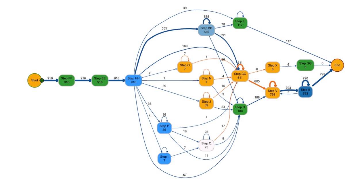
Example of Process Map (DFG equivalent)
We like using the open source version of RStudio as the IDE (integrated development environment) when analysing processes. Installing packages in RStudio is easy, simply type library(bupaR) and library(processmapR) in the console.
bupaR will take any CSV or similar file and transform this into an event log (via eventlog) to be used for further process analysis. Like with PM4Py, you can make use of transformation packages available in R like tidyverse, to ensure data is in the correct format. We found the hardest part of the process mapping experience was transforming the data to meet the requirements for the event log (found here). We highly recommend reading to understand the parts of an event log before attempting to use the function, as we spent a lot of time troubleshooting in this part of the process mapping journey. There is extensive documentation about bupaR, event logs, process maps etc available.
To create an event log:
EVENT_LOG <- eventlog(PROCESS_LOG, case_id = "DOCID",
activity_id = "PROC_TYPE_TEXT.y",

activity_instance_id = "ACTIVITY_INSTANCE",

lifecycle_id = "LOGID",

timestamp = "SDT",

resource_id = "ACTUAL_AGENT")
To create a process map off this event log:
process_map(EVENT_LOG)
The bupaR event map is highly customisable – if you can do it in R, it can be done to this process map. It leverages functions available in the diagrammeR package and is not limited to filtering a certain % of common traces, filtering by duration, changing colours of specific boxes and paths and viewing percentage or absolute value of instances.
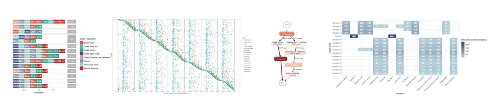
A selection of the different visuals that can be created leveraging bupaR
In regards to integration with Power BI, both bupaR and processmapR are supported packages. This means that we are able to paste the R script into Power BI and run the package to show process maps on a dashboard. We can then build out filters and other graphs that interact with the R process map.
R, unlike PM4Py, does not have predictive process mining capabilities, however, it can be used in conjunction with the R PM4Py library to achieve similar results.
Celonis Snap
Celonis Snap is the free edition of a range of Process Mining tools developed by Celonis. This is a SAAS platform that users can leverage to perform Process Mining without the need to install any software.
A big advantage of Celonis Snap compared to BupaR and PM4PY is its simplicity of usage, allowing non-technical people to go from loading a CSV or Excel file to having a ready to use analysis in less than 15 minutes. The built-in guide describes each step of the process and offers the ability to select the different columns from the data without writing any code. Once the analysis is completed a dashboard is automatically created, providing users with the ability to quickly filter the top x states and transitions by the percentage of occurrence and to filter by all the attributes available in the data source. There is also the ability to create different dashboards and KPIs based on the outcome of the process mining and share those with other individuals.
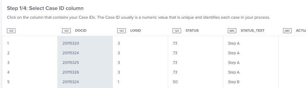
Celonis Snap gives step by step guidance on what to do next
Because Celonis Snap is the free version of a suite of different tools, there are a number of limitations in place. For example, data can be loaded only from Excel/CSV files and source files are limited to 500MB. While we found that the tool is very easy to use for ad-hoc purposes, those limitations make it less fit for purpose in our case for performing the same analysis over time and getting data from other sources (API, SQL etc…).
While Celonis Snap offers the ability to create dashboards leveraging the data it is not possible to embed those in external dashboarding systems like Power BI.
Round-up, benchmark and selection guide
We have listed in the table below the key characteristics that differentiate the three tools we just presented. Hopefully, it will help you get an idea of how each tool compares with the other ones.
| Tool | PM4Py | bupaR / processmapR | Celonis Snap |
| Installation | pip install pm4py
Requires manual installation of Graphviz on Windows. |
Requires manual installation of RStudio, if chosen as IDE.
library(bupaR) |
No installation required, web-based |
| Things we liked | Can be used in conjunction with pandas and Jupyter Notebooks. | Extensive customisable options available and can be turned into an animated process map with tokens. | Easy to use for non-technical users. Easy to filter out the less important data. Ability to create dashboards leveraging the data. |
| Things we liked less | Documentation not complete and lacking examples. Fewer functionalities than bupaR in regards to DFG. | Transformation of data can be extensive. | Sample limited to 500MB.
Only able to upload CSV/Excel files. |
| Integration in Power BI | Possible to integrate with Power BI Desktop but not in Power BI Service. | Yes! Even in the Service. | Not possible. |
| Key technical takeaway | Order your dataframe by ascending timestamp before generating the logs. | Order your timestamp in ascending order before creating event log (R isn’t as smart as we hoped). | No coding experience required to perform an analysis. |
| Performance (with a CSV with about 120,000 lines) | Less than 10 seconds to create the DFG. | Event log takes a couple of minutes, the process map diagram takes less than 10 seconds. | A few minutes when the data has been loaded and key columns have been identified. |
| Capabilities | Limited functionalities in the DFG space in comparison to BupaR and ProcessmapR but able to run mining algorithms like Alpha Miner and IMDFb. | Not able to be used for predictive process modelling (without PM4Py). | Limited to DFG with Celonis Snap, but commercial versions have many more functionalities. |
Lastly, here is our advice of what tool to leverage depending on your specific use case:
| Your use case | Our advice |
| I want to perform a once-off analysis and don’t have programming experience. | Give a go to Celonis Snap. |
| I want to create a Power BI dashboard that includes Process Mapping graphs and I want to share it with other users through the Power BI Service. | Pick bupaR and processmapR and roll with it. |
| I have a large amount of data to analyse. | Our quick benchmark suggests that you could start with giving a go to PM4PY. |
| I want to create a precedence matrix to visualise the flow between the different states. | This is available out of the box with bupaR. |
| If you are familiar with Python then you can jump on PM4Py, and if you are more a R person, do your analysis with bupaR and leverage their interface with PM4PY. |
